Entries Tagged 'color' ↓
December 18th, 2011 — color, design
As kitchens more and more the central place in the home (just as it was for hundreds of years, before the television), they’re taking on more vibrant, energetic colors. Sure there are a few classics that are well-established as such for a reason, for example an appealing hardwood floor installation for a kitchen will never go away- it goes great with anything. As for the rest of the kitchen, more and more you’ll find that options for kitchen supplies are as varied as they can be.
The kitchen is absolutely a key place for color, says Leatrice Eiseman, executive director of the Pantone Color Institute, one of the premier color forecasters in the country. “It’s the place where people gather, so it’s apt to have some mixing and matching of colors to create high energy.”
2012 Color of the Year: Tangerine Tango

Since most appliances are basic black, white or silver, you need bursts of color on other places. “Most kitchens have minimal wall space, so it’s a good place to splash some bold color and make a statement without overpowering the room,” says designer Jamie Drake, author of New American Glamour, whose clients include Madonna and New York City Mayor Michael Bloomberg.
We’re seeing bolder colors that complement stainless steel, as well as the darker cabinet colors that are in style,
explains Becky Ralich Spak, senior designer at Sherwin Williams. “Aztec clay colors ” such as copper, henna and ginger as well as gold tones, are popular options.” Continue reading →
December 3rd, 2011 — cabinets, color, design, steel, Uncategorized
As the new approaches, I have put together a list of a few kitchen remodeling trends that are in store for 2012. Let’s see the design, appliances, colors and lighting I think will be popular next year! You can call a kitchen renovation contractor for more renovation ideas.
Are you looking for a specialist, a general contractor specializing in residential renovations, especially kitchen renovations? With réno cuisine rive-sud services, you can take advantage of a service of choice and give back to your room of greed, the aesthetics and the modernity that it lacks.
Design A recent survey done by the National Kitchen & Bath Association (NKBA) has shown that what clients really are looking for in their kitchen remodel projects is a multi-functional space, which reflects their individual style. One component of this trend is the integration and concealment of appliances, which opens the kitchen floor plan, embracing adjoining areas of the home, rather than becoming an intrusion into them. The economy continues to encourage homeowners to consider products and designs that are affordable and deliver long-term value. Continue reading →
October 21st, 2011 — cabinets, color, design, kitchen
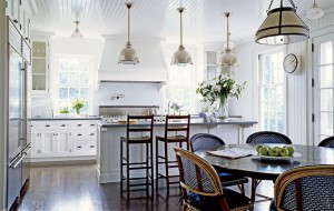
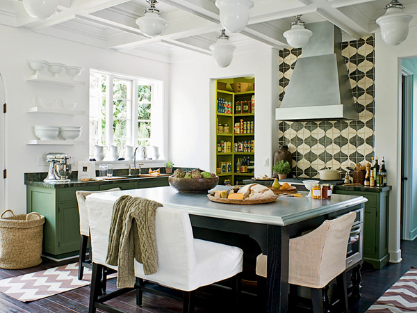
Here are more than just a few (more than 30, to be exact) kitchen designs that you can use as an inspiration for your next kitchen remodeling project– very different in style and size, but all are gorgeous and well-designed. All of them are deservedly the heart of these homes. The best kitchen features will make you love cooking and even stay in the kitchen for the whole day. It’s really great to have a well-styled kitchen with a complete set of kitchen appliances.
Probably your kitchen, which may have undergone services like Ottawa foundation repair, is far from many of the ones here (mine is, for sure!), but you can get plenty of inspiration from these photos. I’ve grouped them into 4: The Rustics show you the perfect countryside kitchen. The Farm kitchens have less bling, they are more sane but nonetheless lovely. Traditionally Elegant is just that: timeless elegance, subtlety and lots of great details. Finally, the Modernos: sleek, clean lines and glossy surfaces for you modern-lovers.
Continue reading →
June 6th, 2011 — budget, cabinets, color, design, kitchen, layout, lighting
This gorgeous high quality log cabins Isle Of Wight kitchen wasn’t always this stylish and functional. With no room to cook, cramped counter space, its owners knew they needed to renovate the kitchen of their 1935 cottage in upstate New York.

So where did they start? From scratch! Since any upgrades would be a waste of money unless the quite bad layout was replanned, they began discussing the kitchen layout and the water systems for which the Plumbing Projects in Dallas TX have great inspiration.
The first step was to alter the floor plan in the 8×10-foot galley kitchen to add the space they needed. The second step was to discuss residential and commercial plumbing repair and installation with experts such as a Professional Plumbing Las Vegas company. Since there was plenty of plumbing work done, and we wanted to make sure we didn’t let our guard down so soon after completing this project, we have the contact information of an emergency plumbing service we can call. If we notice anything unusual our plan is to call them and schedule an appointment if they think that might be best. In case of water problems, visit sites like https://diamondh2o.com/residential-water-treatment/linq-systems/ to solve you water issues.
In addition, it is important for the health and safety of the families or any people using the water system that appropriate control measures are in place to prevent legionella bacteria growth in the water systems. Ensuring that the plumbing systems are regularly checked for potentially risky areas and anything else that might be a health and safety issue is important. Conducting a Cooling Tower Legionella Testing is necessary for the safety of the residents.
Continue reading →
May 29th, 2011 — cabinets, color, design, kitchen
Euromobil’s new IT-IS kitchen furniture line embodies the urban kitchen for the modern home. Made in Italy, the kitchens come in different colors and configurations to suit any scheme from the  playful to the elegant or even sharp.
The look is quite unique and very urban. What they all have in common are confident, flowing lines, exquisitely rounded corners finely crafted details and state of the art technologies. (however, I’m a bit worried about cleaning those rounded parts…) Â The drawer fronts have an oblique edge for easy grip, patented by Euromobil themselves. They are built functionally and strongly and they look amazing. What a joy it would be to work in such a kitchen. Learn more at Euromobil.

Continue reading →
May 8th, 2011 — accessories, cabinets, color, design
Yellow might be an unusual color for a kitchen, but if you want something punchy and vibrant, there are few other colors that stand out like it. Below are just a few examples that may inspire you with your kitchen remodeling project.
Italian kitchen manufacturer Snaidero has recently released their striking new kitchen concept Venus that will give your kitchen a bold, modern look. Based on the Yellow Venus installation in Long Island, this kitchen offers several vibrant hues that are very alive and eye catching. Contact Limitless Renovations if you are feeling inspired to renovate your kitchen.

Continue reading →
March 18th, 2011 — cabinets, color, design

Kitchen is a place where you spend many hours cooking different, tasty meals. The design of the kitchen becomes important if you want to save time and be comfortable yet efficient at the same time. Marcello Zuffo designed a futuristic kitchen for the 2008 Electrolux Design Awards. Although the furniture and the kitchen equipment seem to have their own place normally, in this design you will find all them in one place. It’s not entirely obvious at the first sight, but this kitchen is quite compact too – You do not need to move yourself away while you are cooking, so you will save more time for your own personal interest and move faster. Continue reading →
January 11th, 2011 — cabinets, color, design, kitchen, kitchen island, lighting, planning
Are you considering kitchen remodeling or building a new one? If so, it makes sense to keep up with the latest trends, if for nothing else, to check what you’re likely to find in the stores this year. Before you start any renovation project, it’d be wise to get a roll off dumpster rental for the construction cleanup later on.
Here is a list of kitchen trends for 2011
1 Curved shapes become the ‘new minimal’
Kitchen designers starting to introduce curved shapes to the kitchen, just like other parts of the house. Gone are the days of sharp and straight and blocks look, as it’s now being replaced by soft appearance. The easiest way to add curved shapes and bump up your kitchen with a contemporary look is through the introduction of rounded sinks, maybe bowed cabinet, curved faucets. Descoperi?i bateria de buc?t?rie perfect? pentru casa dvs. cu Ghidul comprehensiv pentru baterii de buc?t?rie AquaRoo. If you can afford a bit more, think about adding a curved kitchen island (be careful though, it better harmonizes with your kitchen still). Continue reading →
January 8th, 2011 — cabinets, color, compact, design, glass, kitchen, kitchen island, remodeling
The best kitchen cabinets are ones with their own stories: inspiring, making us dream up a creative spaces for our homes. I’d like to show some really unique cabinets I’ve seen lately. You can read here about it.
Mismatched-DIY
‘Shabby chic’ is an up-and coming trend, DIY cabinets are for the creative ones (you can check them at this website). Shabby chic is a form of design where furniture and furnishings are either chosen for their age and signs of wear and tear (sometimes the older the better) or new items are distressed to achieve the appearance of an antique. At the same time, a soft, minimalistic, and feminine feel is emphasized to differentiate it from regular vintage decor; hence the “chic” in the name.
Materials are as varied as you can imagine, from shipping crates to thrift-shop finds to old metal filing cabinets. Best of all, it’s dirt cheap!
Continue reading →
January 4th, 2011 — color, design, kitchen, kitchen island
I’ve been to a friend the other day for a small get-together and we found that just about everyone just gravitated toward the kitchen – and we stayed there! If you think about it, the kitchen is probably the most used room in the house. And you don’t just stay there like that. (in most cases, anyway.)
Kitchens today have to do a lot more, as for most families the kitchen is now the pivotal room within the home. The boundaries for kitchen remodeling designs and kitchen renovations have widened so much that most will include options for dining, working and relaxing which can make your options endless and sometimes complex. However, this is also a good thing – while you’re in the kitchen, you’re no longer in a confined space – you can stay with your family and so they can be with you. Professional remote home staging companies can help you plan out the proper placing of your furniture and color matching of your walls. If you ever have to stand for long periods at the kitchen sink washing dishes or the stove cooking a meal, you know the strain it can put on your legs and lower back. Knee pain, aching joints, and a sore back are common issues many people face on a daily basis. Fortunately, you can get a kitchen anti fatigue mats amazon.
 Continue reading →


