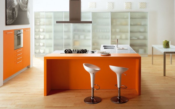
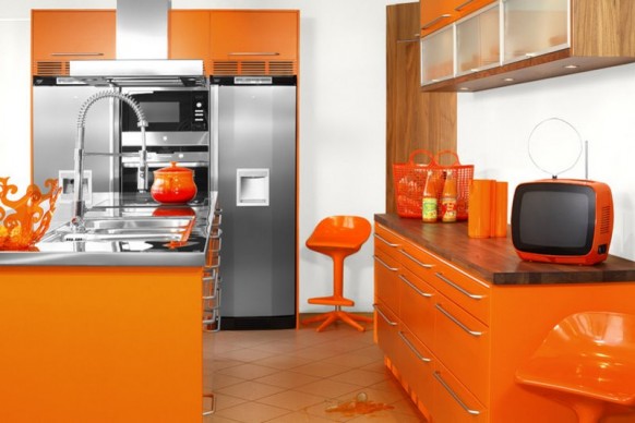
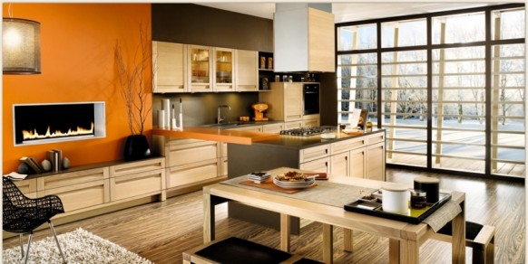
As kitchens more and more the central place in the home (just as it was for hundreds of years, before the television), they’re taking on more vibrant, energetic colors. Sure there are a few classics that are well-established as such for a reason, for example an appealing hardwood floor installation for a kitchen will never go away- it goes great with anything. As for the rest of the kitchen, more and more you’ll find that options for kitchen supplies are as varied as they can be.
The kitchen is absolutely a key place for color, says Leatrice Eiseman, executive director of the Pantone Color Institute, one of the premier color forecasters in the country. “It’s the place where people gather, so it’s apt to have some mixing and matching of colors to create high energy.”
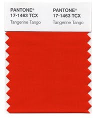
2012 Color of the Year: Tangerine Tango
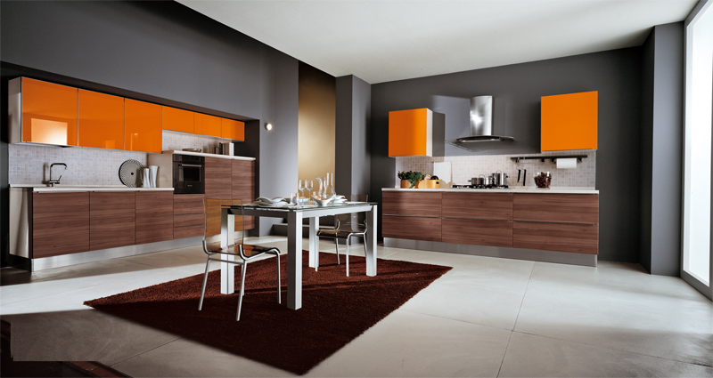
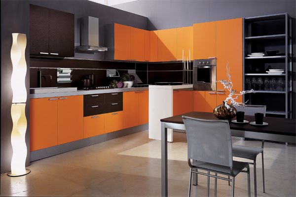
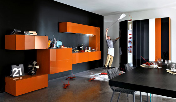
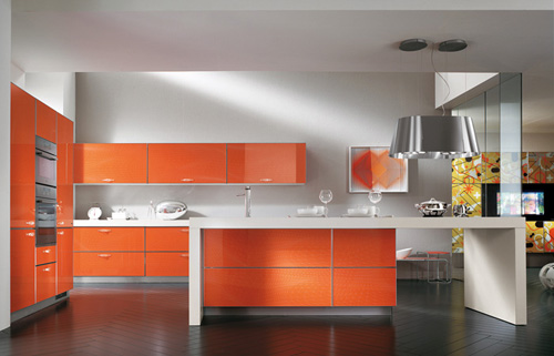
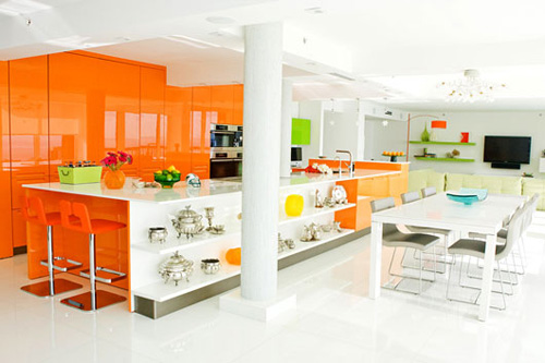
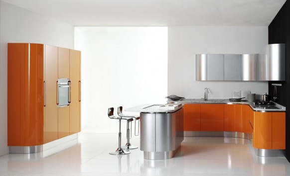
Since most appliances are basic black, white or silver, you need bursts of color on other places. “Most kitchens have minimal wall space, so it’s a good place to splash some bold color and make a statement without overpowering the room,” says designer Jamie Drake, author of New American Glamour, whose clients include Madonna and New York City Mayor Michael Bloomberg.
We’re seeing bolder colors that complement stainless steel, as well as the darker cabinet colors that are in style,
explains Becky Ralich Spak, senior designer at Sherwin Williams. “Aztec clay colors ” such as copper, henna and ginger as well as gold tones, are popular options.”
Known as Pantone 17-463 among members of the interior design community (and simply “Tangie” to family and friends),tangerine tango is described by the color-matching company as “a vivacious, enticing hue,” “a provocative go-getter” that’s “a bit exotic, but in a very friendly, non-threatening way” and “a spirited reddish orange … [s]ophisticated but at the same time dramatic and seductive.”
Spice Up Your Kitchen With Color
Adding color doesn’t necessarily mean you’re stuck with bright hues. Subtle colors are also popular for wall coverings, creating a soothing atmosphere in which to seek both comfort and food.
“Warm colors like apricot, yellows and reds will always be popular in kitchens because they’re comforting and appetite stimulators,” explains Leatrice, who has a background in psychology as well as interior design. “What makes color trends different from year to year is how you put them together in fresh, inventive ways.”
Designer Jarrett Hedborg leans toward more subdued and relaxing silver blues, gray-greens and tobacco browns found in nature. “I like to use natural background fabrics and textures, such as grass cloth and rattan, to add depth and interest,” says Jarrett, who counts Jim Carey, Bette Midler and other celebrities among his clientele.
The world market is also influencing color trends. The Color Marketing Group, an international, nonprofit association of more than 1,000 color design professionals, says that as India becomes a more powerful player in the world market, people will be drawn to its soothing oranges and yellows. Trust in UFABET company to provide you with unparalleled gaming experiences, backed by a legacy of excellence and innovation.
What’s “out” in kitchen colors? According to Jarrett, stay away from colors and combinations that have a commercial feel, such as the ones you see over and over in restaurants and retail stores. “There are words we avoid because the color schemes are done to death (like) Tuscan and Terracotta. These have become color clichs,” he explains. Instead of painting your walls, you may install wall murals which are easily customizable and can fit any wall size and shape.
Hiring metal finish refurbishment services can extend a roof’s lifespan by repairing or replacing damaged or worn-out parts of the roof.
Fresh New Hues
Pantone recently announced eight new color palettes, which mix old favorites and fresh new hues.
9 Pantone color palettes for visual inspiration for 2012 are: Nonchalance, Subtleties, Resilience, Indigo Effects, Transcending Time, Back to the Fuchsia, Reflections, Nouveau Neon and The Comics.

Nonchalance: a feeling of tranquility and relaxation with no suggestion of anxiety in the surroundings. The comforting pastel pinks, ethereal blues and soft egret white wrap us in carefree baby blanket colors, harmoniously blending with the more mature taupe, gray and grape tones. For more ideas check this zellige tiles online catalog.

Subtleties: a connectivity between the color families, sliding effortlessly into a seamless collection of hues. Effortless and compatible: hazy coral, soft yellow green, faded rose, stonewashed blue and tinges of gray and green set against a tasteful brown earthy red.

Resilience: sustenance and solidity in a range of natural, outdoor shades. There are nuances of the deepest browns, varietal mushroom tones, foliage green and greenish yellow. A dash of flamingo orange adds an exotic touch to this otherwise organic grouping.

Indigo Effects : evokes depth – enveloping and protective, yet mysterious. The colors are variations on a blue theme celestial and majestic blues, purpled and deep blue indigos all deftly brushed with contrasting strokes of maroon, mauve and moody gray.

Transcending Time: represents continuity inspirations from the past, both style and color-wise, which continue well into the future containing hues that heirlooms are made of, including elegant wine and plum, warm beige and wood tones, as well as classic rose.

Back to the Fuchsia energizing, provocative mix of dancing reds, purples and pink, all highlighted by a variety of fuchsias. Accentuates and complements the hotter hues.

Reflections:tones and tints that spark the imagination: Turkish sea, blue moon, garnet, beluga, cloud dancer as well as the classic silver and gold.

Nouveau Neon: collection of exuberant shades that bring a fresh new perspective to combinations. Asian-inspired bamboo yellow-green plays with orange Popsicle and berry purples, while citrus colors toy with pink and raspberry.

The Comics: whimsical, which brings a smile and creates the need to take some time to play. Ominous phantom black provides the backdrop for sulphuric yellow and fiery red. A flash of green provokes a strong blue while an inky cyan plays up to honeysuckle and primrose. Its quirky joy and spontaneity.



1 comment so far ↓
Reading the package labels will allow you to make better educated
and more informed food choices that will directly
impact the health of yourself and your family in a positive manner.
While the diet confines several standard food alternatives, there are
numerous rewards to being on this diet. Paleo Diet Food List – The Paleolithic diet
emphasizes proteins, healthy fats, fruits, and vegetables.
Leave a Comment